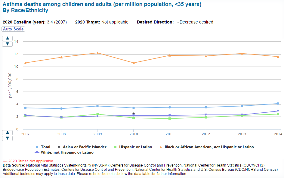
Jordan N - This graph is showing the amount of people per 1 million die due to asthma in each respected race. The important thing to notice here it that there are 2 times more African American's die to million than does every other race, even though their population is represented in a smaller amount. Also, the Asian population was not properly represented as there was only data for one year. In this graph it is also important to realize that even though African American's have the highest mortality rate, theirs is the only one that appears to be going down, where as everyone else's mortality rate is going up.
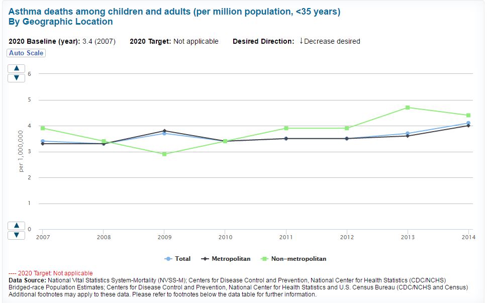
Bergen J - This graph is depicting the asthma-related deaths from 2007-2014. It is using data from individuals under the age of 35 years, and is organized by geographic location. What the graph is showing is that generally, non-metropolitan areas have a greater number of deaths related to asthma, while metropolitan deaths tend to stay closer to the average, as depicted by the light blue line. Asthma-related deaths in the non-metropolitan area dipped in 2009, but reached an all time high and are continuing to stay higher than before as of 2014. Although the cause is unknown, deaths related to asthma overall are rising, regardless of location.
Office of Disease Prevention and Health Promotion. (2014). Asthma deaths among children and adults by geographic location. Retrieved from https://www.healthypeople.gov/2020/data/Chart/5163?category=10.1&by=Geographic%20location&fips=-1
Office of Disease Prevention and Health Promotion. (2014). Asthma deaths among children and adults by geographic location. Retrieved from https://www.healthypeople.gov/2020/data/Chart/5163?category=10.1&by=Geographic%20location&fips=-1
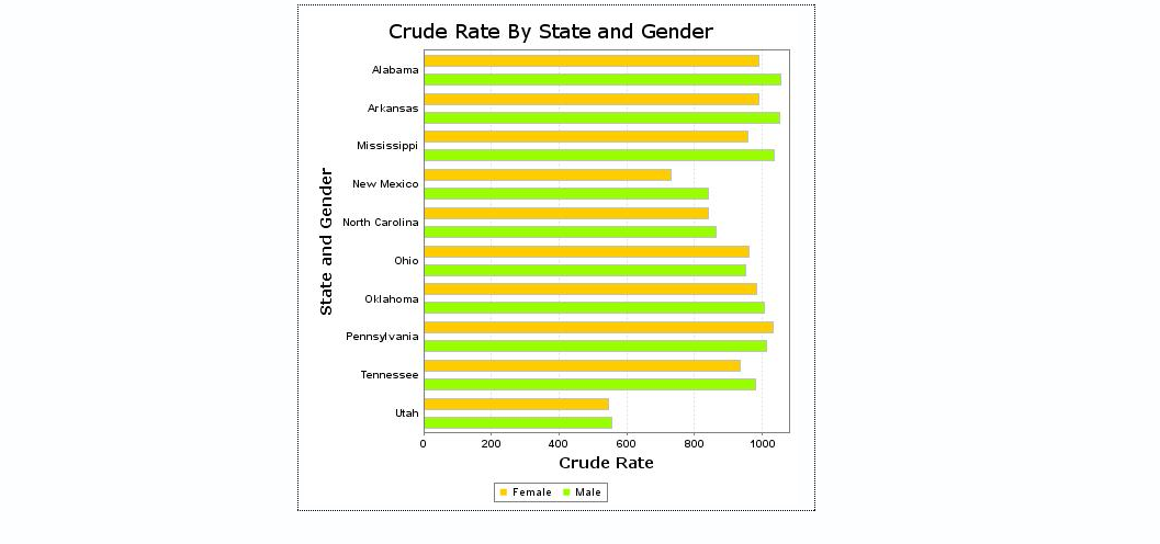
Camille H- This graph allows us to see the different prevalence rates of asthma between males (green) and females (yellow -orange). Since there is a higher prevalence of asthma in females rather than males, (after the the ages of adolescence) the graph shows that in most of the states, the crude rate is higher for females. According to the graph, there is also a higher prevalence of asthma in states that tend to have an unusually colder of warmer climate such as Alabama and Arkansas. This graph shows how females are more affected by asthma than males, and how climate can determine what people are affected by asthma.
CDC WONDER FAQ Help Contact Us WONDER Search. (n.d.). Retrieved April 24, 2017, from https://wonder.cdc.gov/ucd-icd10.html
CDC WONDER FAQ Help Contact Us WONDER Search. (n.d.). Retrieved April 24, 2017, from https://wonder.cdc.gov/ucd-icd10.html
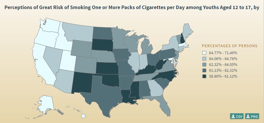
Kiauna M-This map show the risk of smoking per day in people between the ages of 12 to 17. Light blue states shows there are a higher risk than the darker blue colored states.
